Orso Nero Restaurant
Interiors, Branding
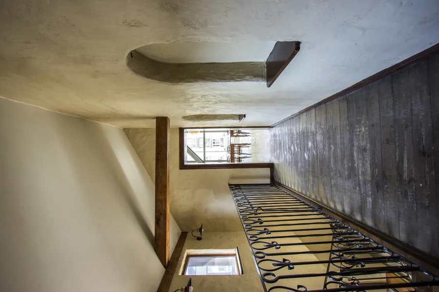
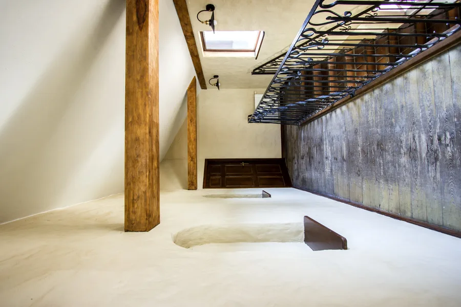
Orso Nero was a total creative act. The restaurant name, logo, complete visual identity system, and 389 to 420 square metre interior were conceived as a single unified design project across two usable floors and a basement at Aleksandra Fredry 1a in Bydgoszcz. The building was a historic forester's lodge, a Lesniczowka, whose material language of exposed timber beams, wrought iron elements, ornamental masonry, and dramatic triangular steel-framed windows on the upper floor had been concealed by the previous tenant, Dolce Vita, behind curtains and conventional restaurant decor. The existing building was the design's greatest asset. The work was to unlock what was already there.
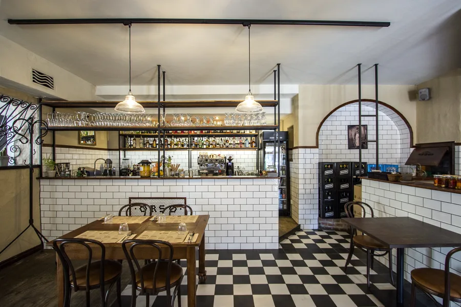
The name Orso Nero, Black Bear, came from Rise.Design, and so did the whole visual identity. Seven years in Milan is where that fluency comes from: Northern Italian food culture and the way a trattoria actually looks. The concept was Italian classicism, traditional and modern in the same room, a new-wave trattoria and bar with none of the theming. Northern Italy means cured meats, smoked things, butchery-shop culture, and that goes straight into the materials. White irregular subway tile against hexagonal tile compositions is the old-school Italian macelleria.
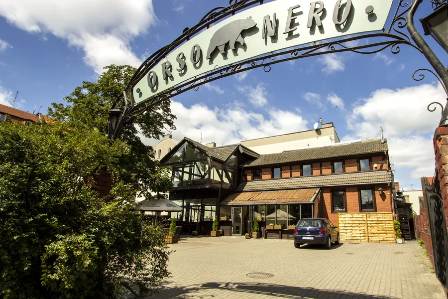
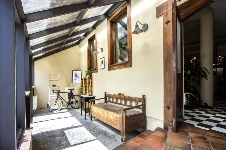
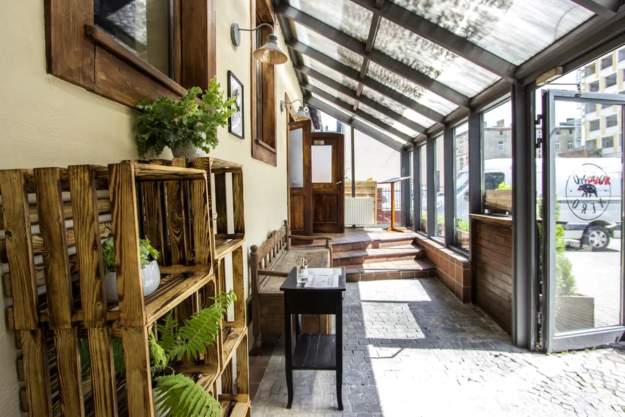
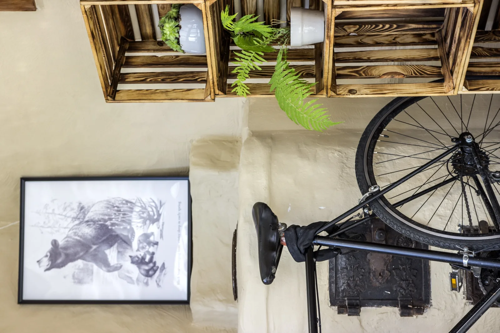
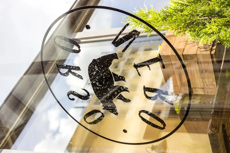
The approach path sets the tone. An ornate wrought iron arched gateway bearing the ORSO NERO lettering and bear silhouette emblem leads through a cobblestone courtyard to a glass-roofed vestibule. This conservatory transition space has a cobblestone floor, antique wooden bench, repurposed wooden crates planted with ferns, and the bear logo on the glass entrance door. A terracotta threshold marks the material boundary between street and restaurant.
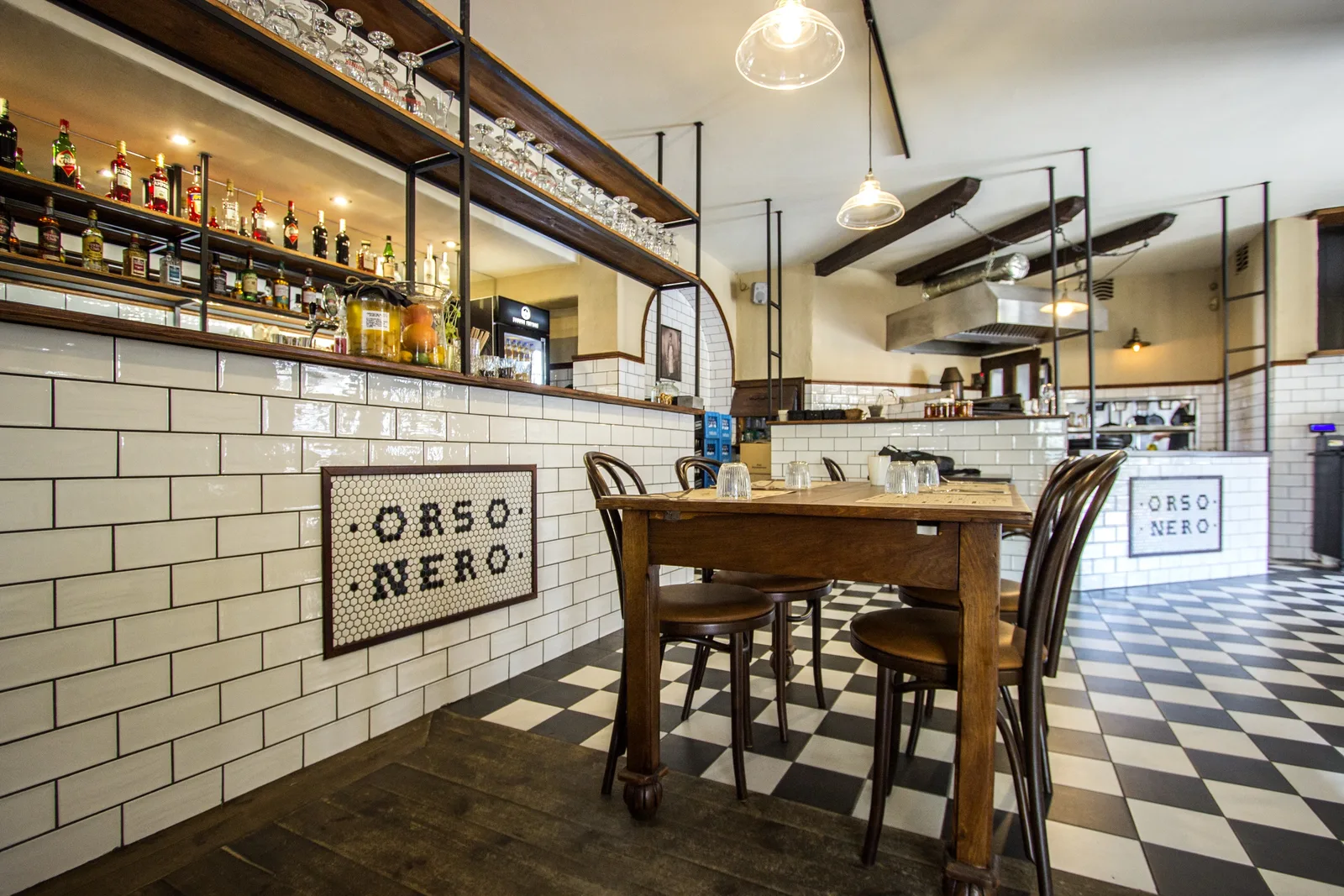
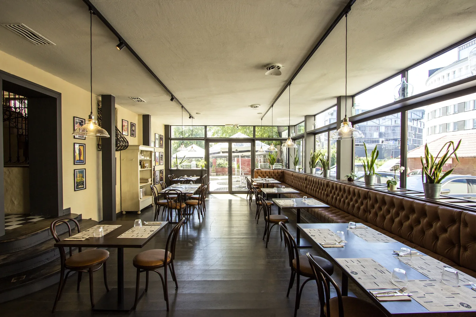
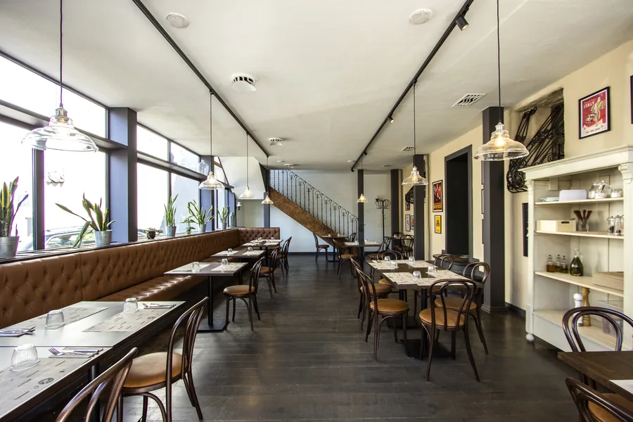
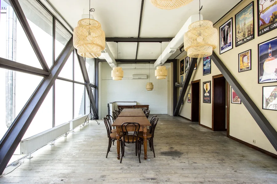
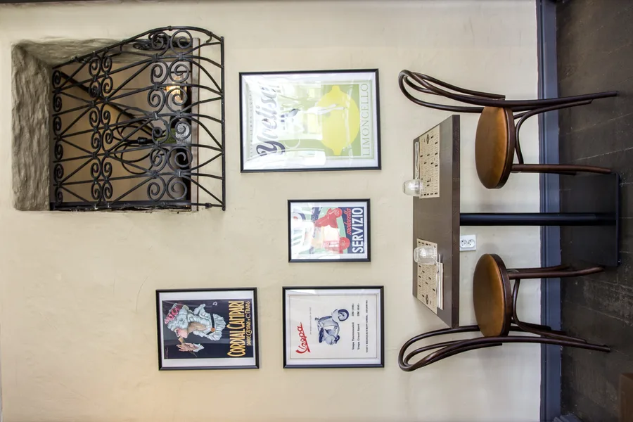
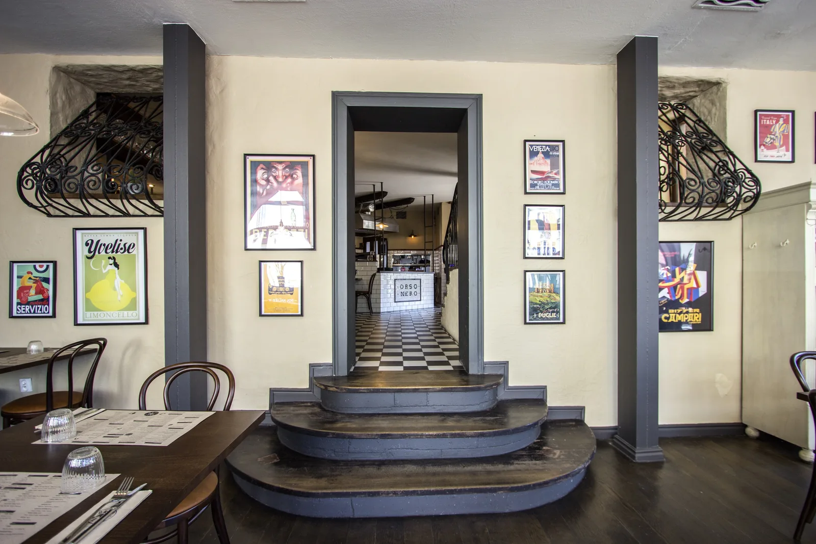
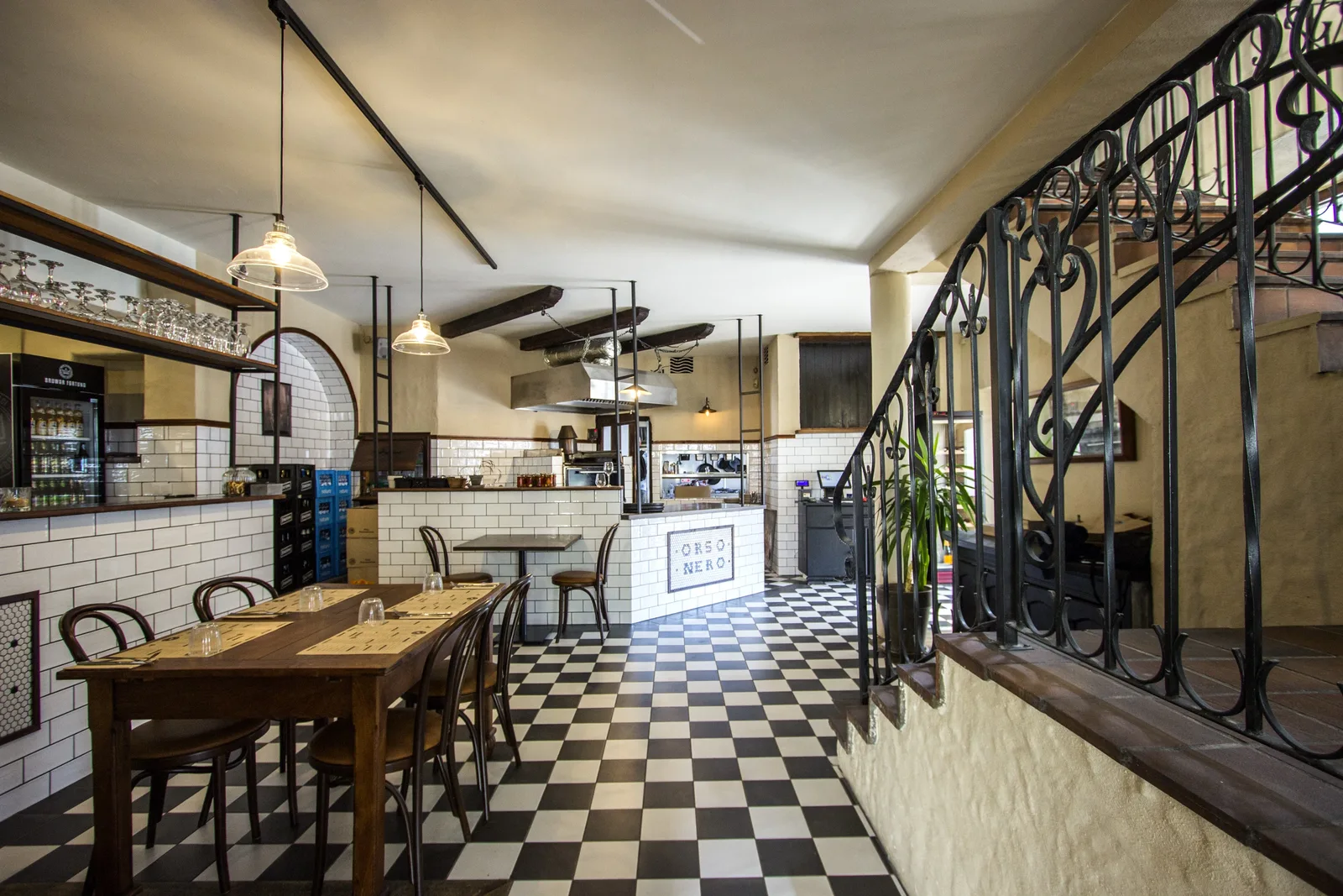
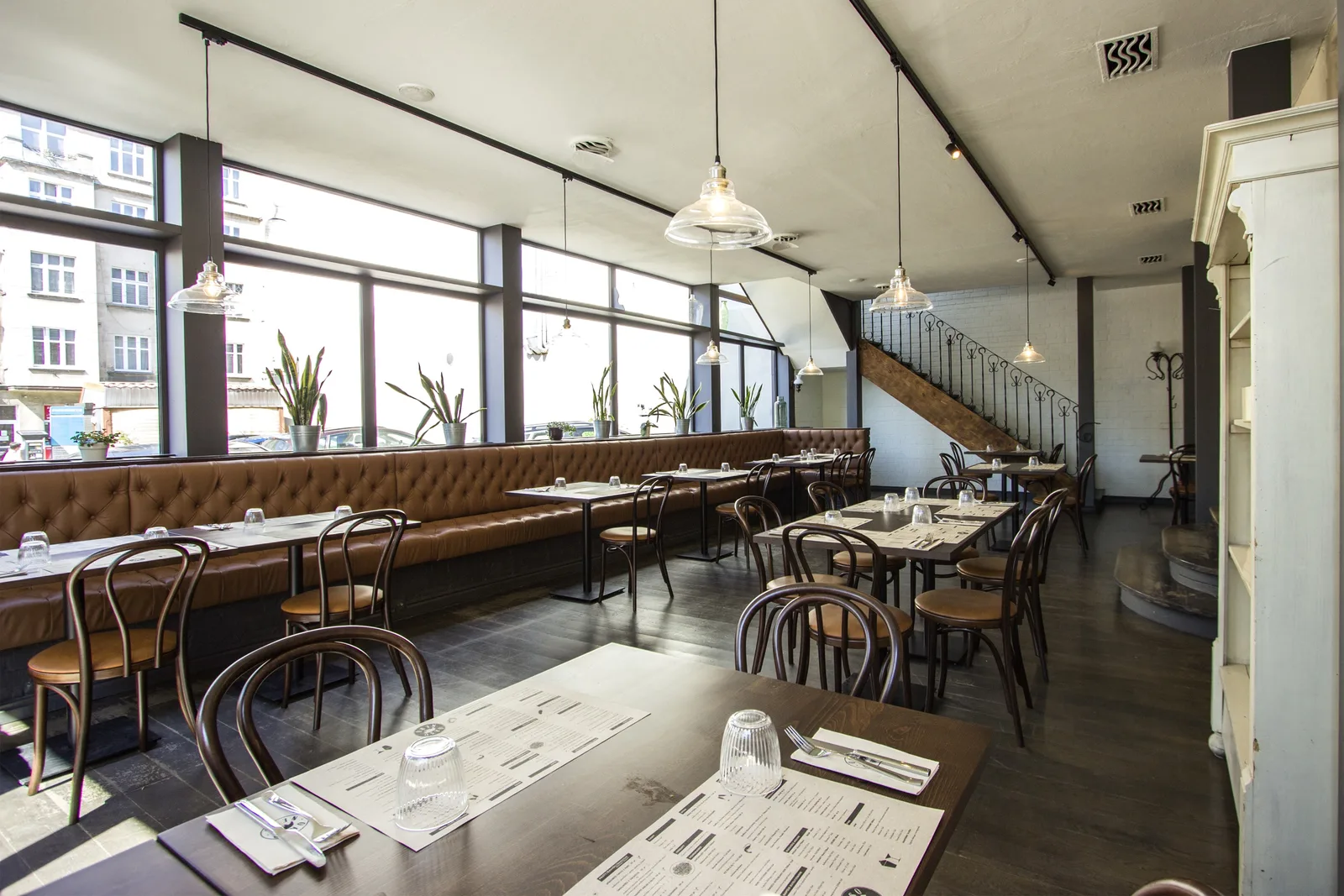
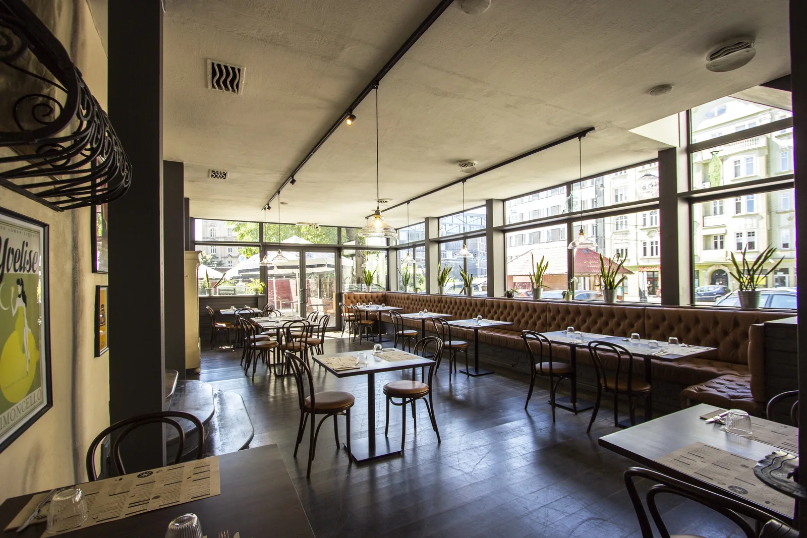
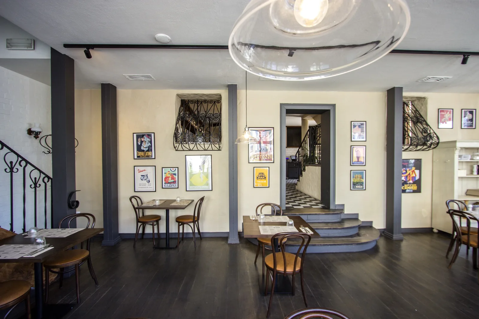
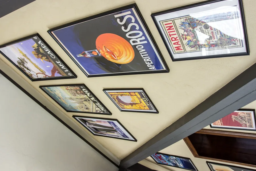
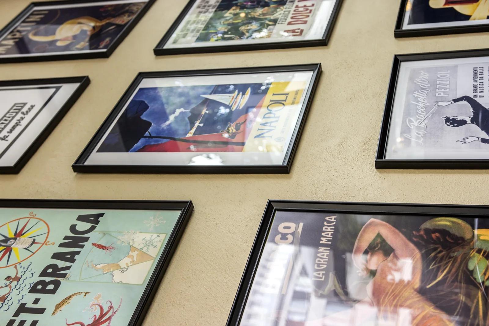
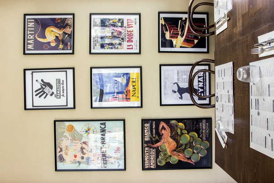
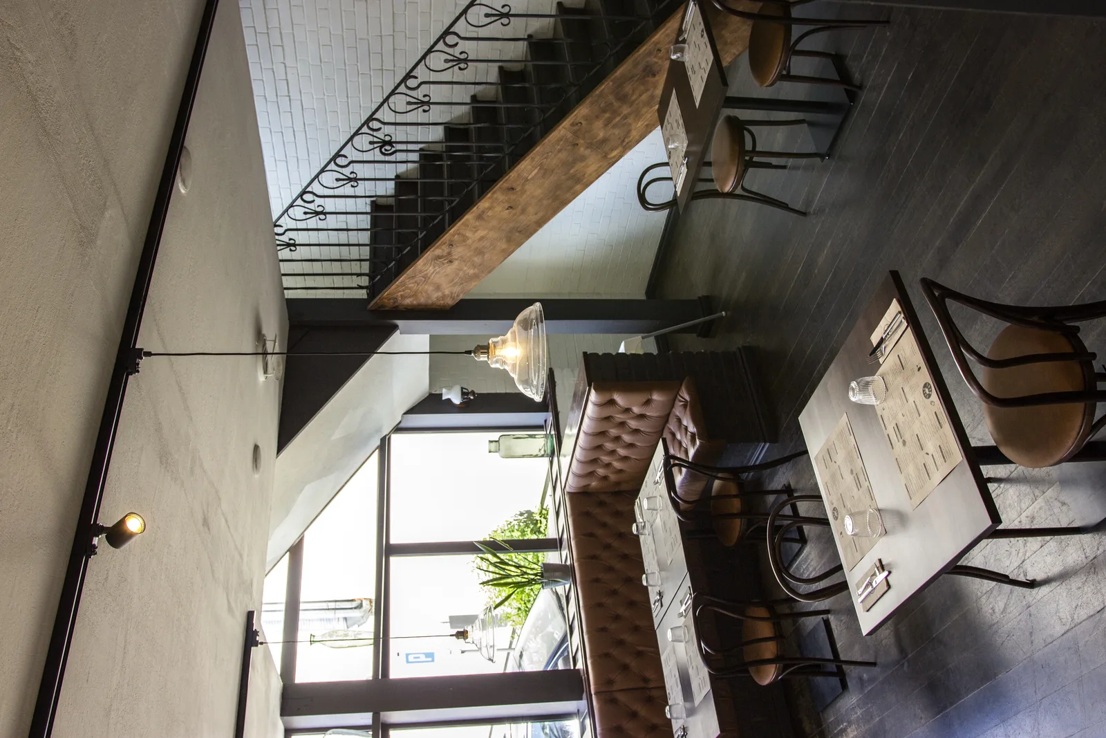
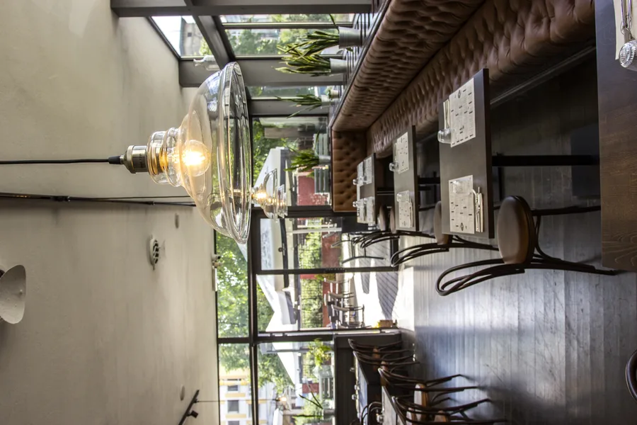
Two dining experiences sit on two levels, joined by a sculptural microcement staircase. The ground floor seats 49 and works as a close trattoria. Cognac leather Chesterfield banquettes along one wall. Fameg A-18 bentwood chairs in dark walnut stain at vintage 1950s Polish tables, renovated by the carpenter F&B Decor with the drawers and period details kept. A wall of Italian vintage poster art. A black-and-white checkerboard floor in 20x20 cm tiles across 55.2 square metres, with dark stained timber over the rest. The bentwood chair has been in continuous production since the 1870s and everyone reads it as European hospitality without being told. That is why it is there.
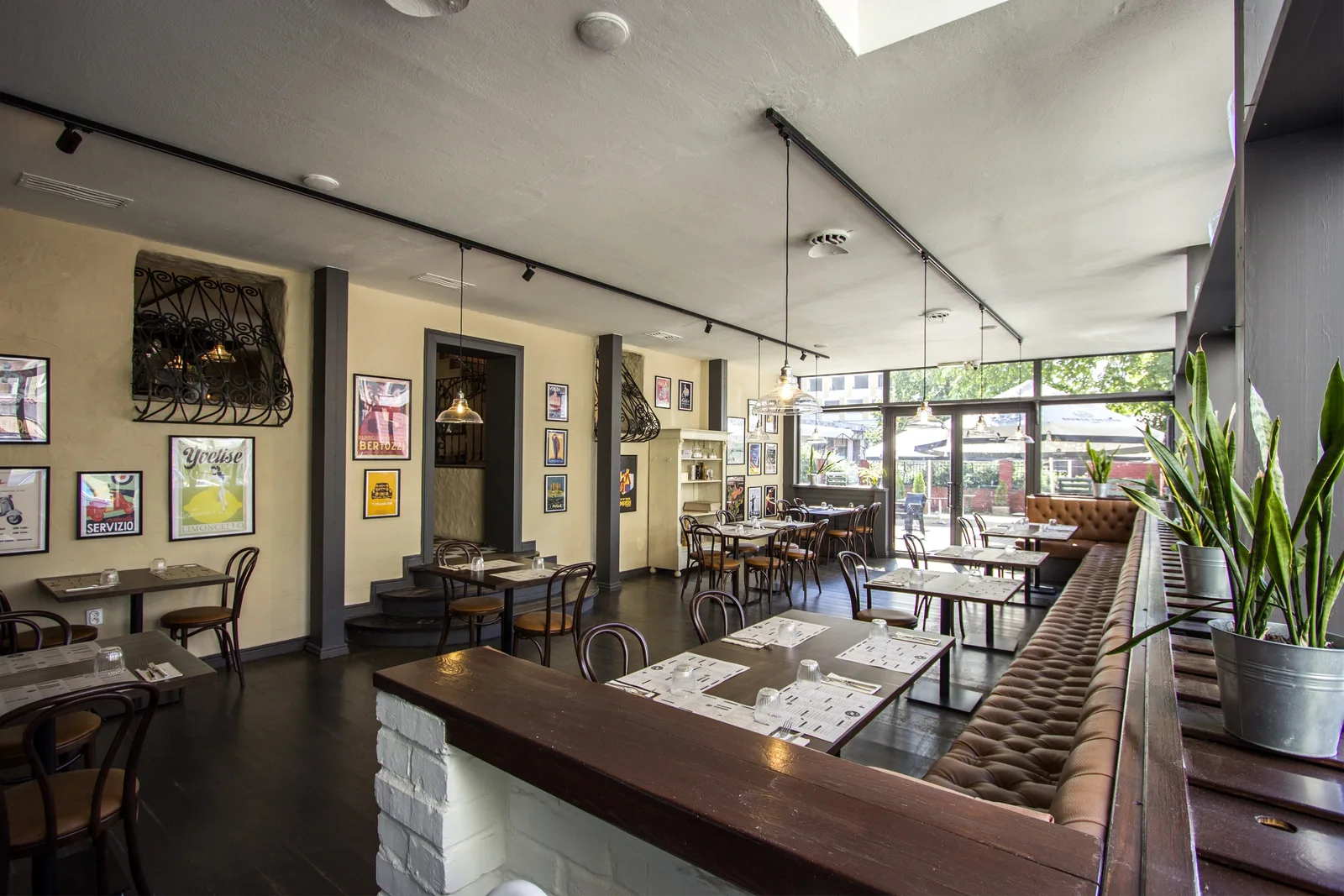
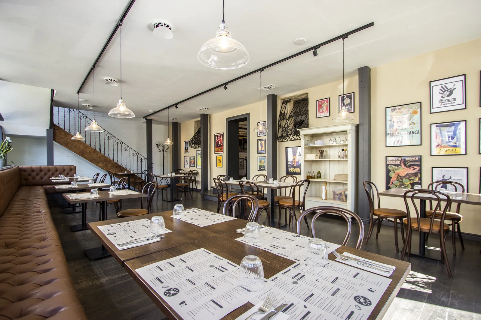
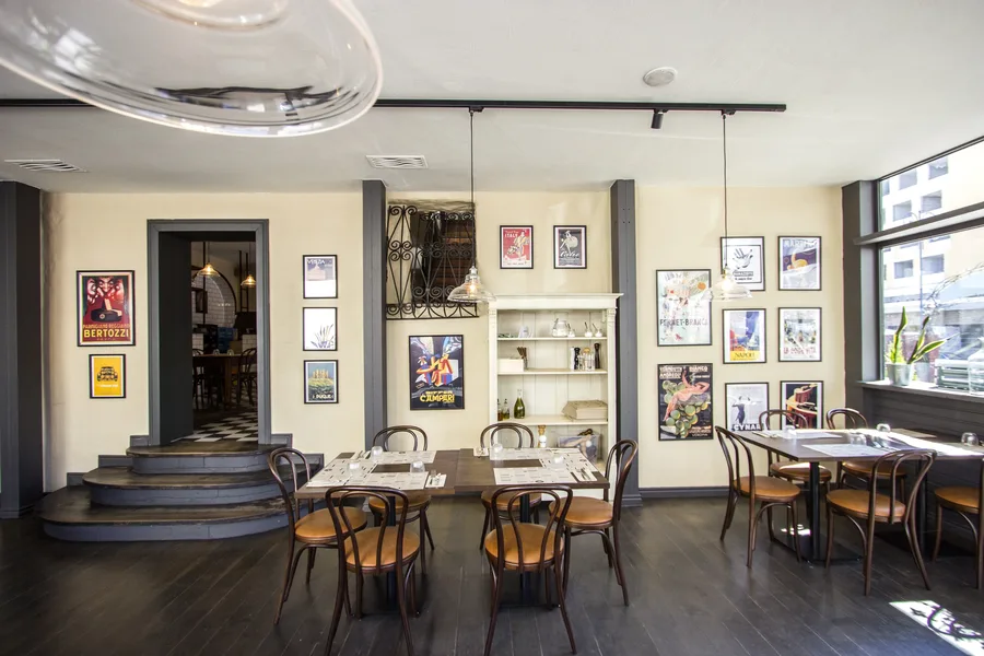
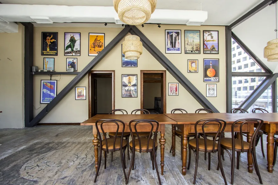
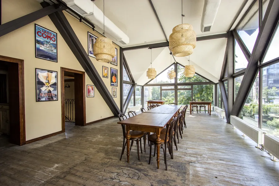
The trattoria furniture strategy was anti-retail. Rather than purchasing new, Rise.Design sourced 1950s to 1960s Polish tables and had them professionally renovated by F&B Decor, each one carrying decades of genuine patina into its new life. The vintage Italian poster collection, including Campari, Martini, Fernet-Branca, Cynar, Vespa, Lago di Como, Milano, and Napoli, serves a deeper function than decoration. In a city with no Italian cultural infrastructure, these objects anchor the space in a specific visual tradition the design demands.
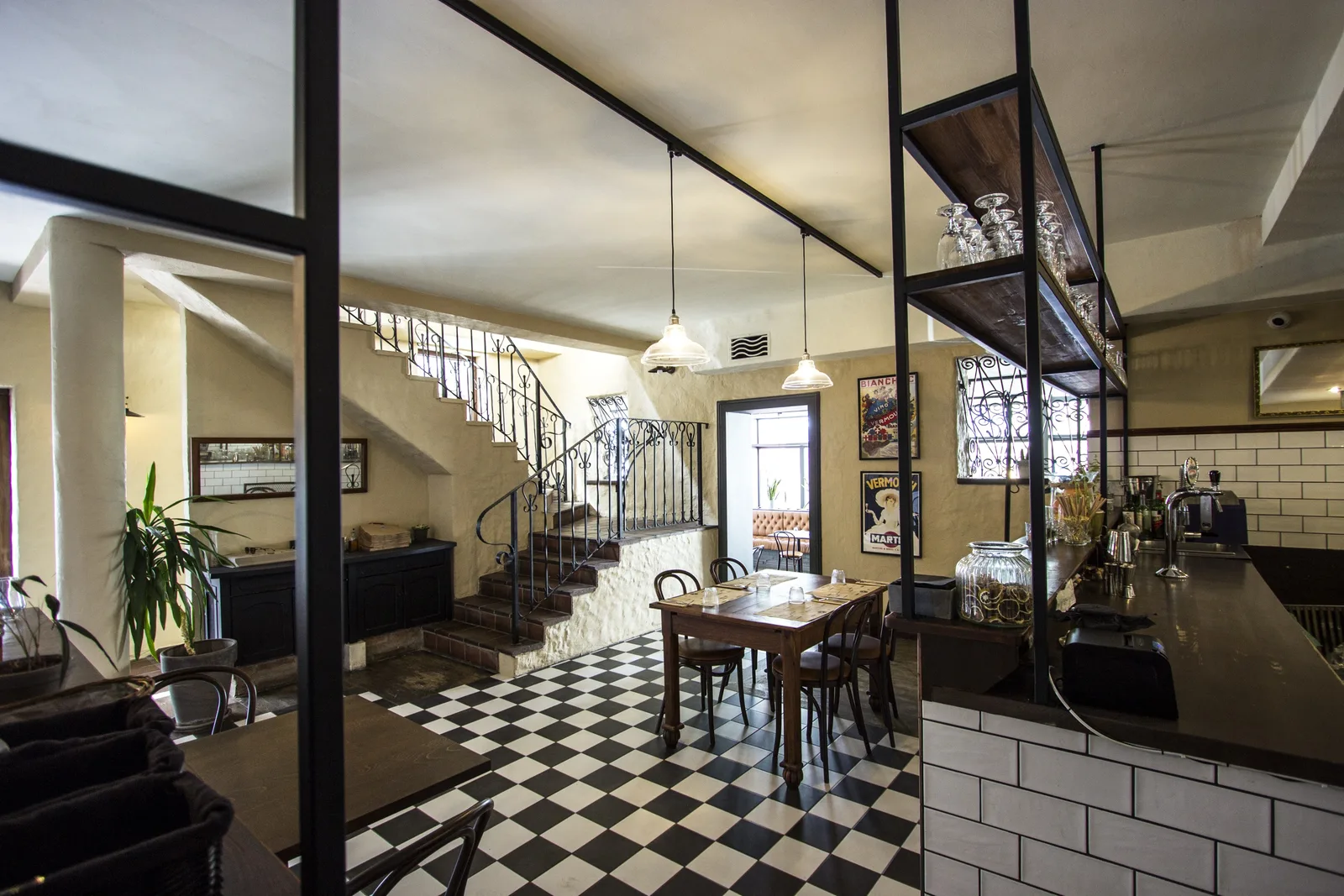
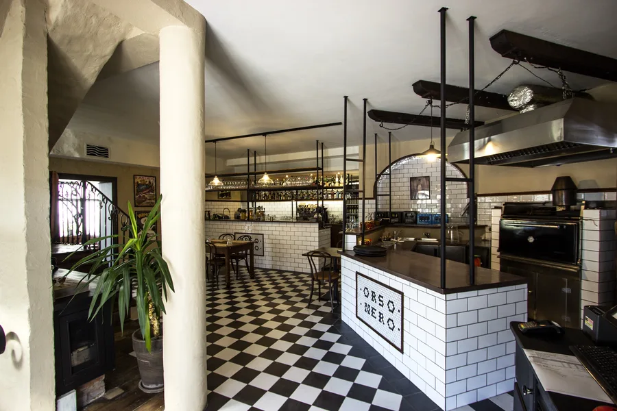
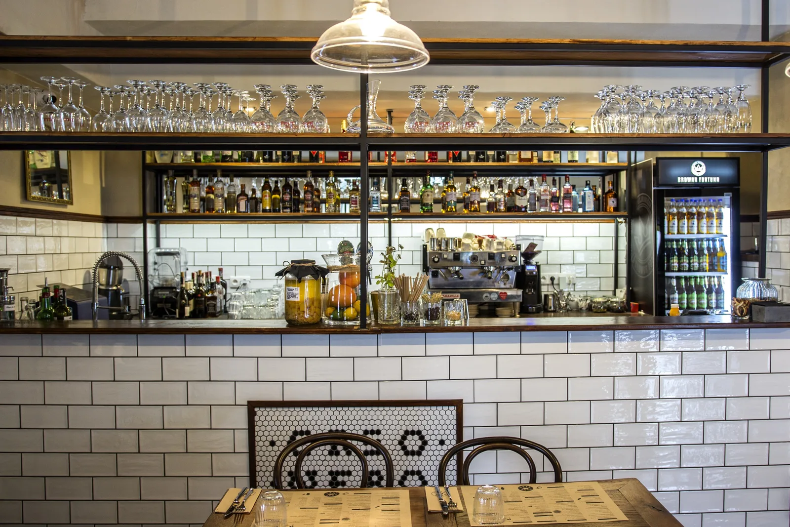
The bar is where brand creation and interior architecture merge into a single element. An L-shaped counter, 446 cm on Part A and 706 cm on Part B, features a custom hexagonal gloss tile mosaic spelling ORSO NERO across the counter front. The mosaic sign measures 87 by 50 cm within a 93 by 56 cm frame, its koi-scale patterned surface catching light differently at every angle. Subway tile cladding references the old-school Italian macelleria. The hexagonal mosaic turns the graphic identity into a built surface. Behind the counter, backlit bottle shelving on an industrial black metal framework and copper dome pendants complete the composition. The bar functions simultaneously as cocktail station, brand signature, and architectural centrepiece.
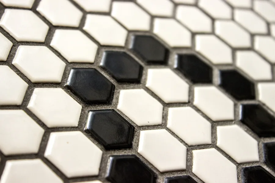
The mosaic received its own dedicated detail drawing, D1 at 1:10 scale, a level of documentation typically reserved for structural elements. The bar was documented across four detail drawings (M1 to M4) at 1:25 scale, reflecting how central it was to the entire project.
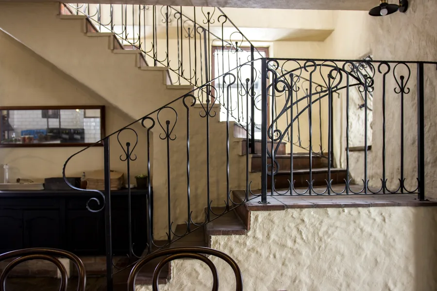
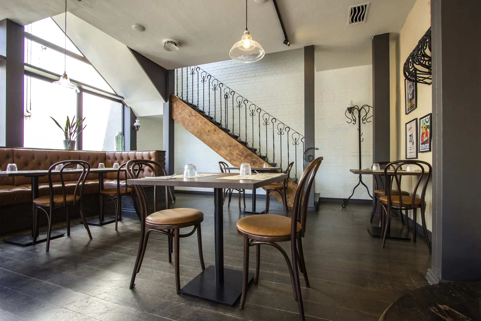
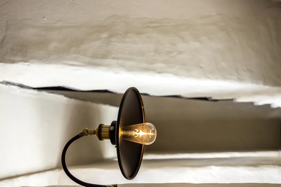
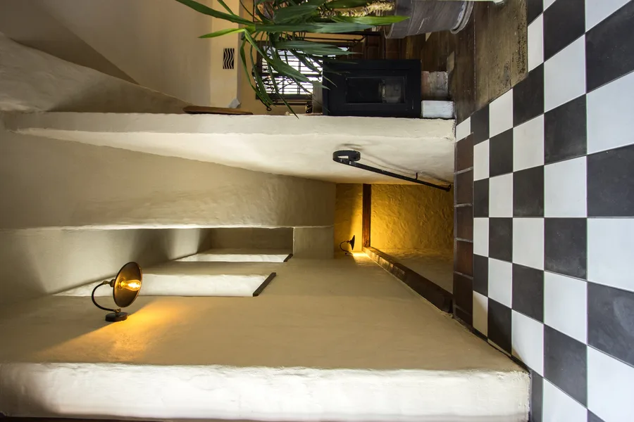
The staircase connecting the two dining levels is a sculptural intervention within the heritage building. Poured microcement in organic curved form creates a landing that is simultaneously functional and architectural, contemporary in material but integrated with the surrounding wrought iron balustrade and reclaimed timber wall panels. Vintage brass desk-lamp style floor lights on the landing provide atmospheric uplighting as guests ascend between the two radically different dining experiences.
The choice of microcement, poured and shaped into organic curves rather than conventional rectangular treads, is a deliberate material provocation within the heritage building. Where every other surface honours the existing timber and iron, the staircase introduces a contemporary material language that marks the transition between the two dining levels without attempting to disguise itself as historical.
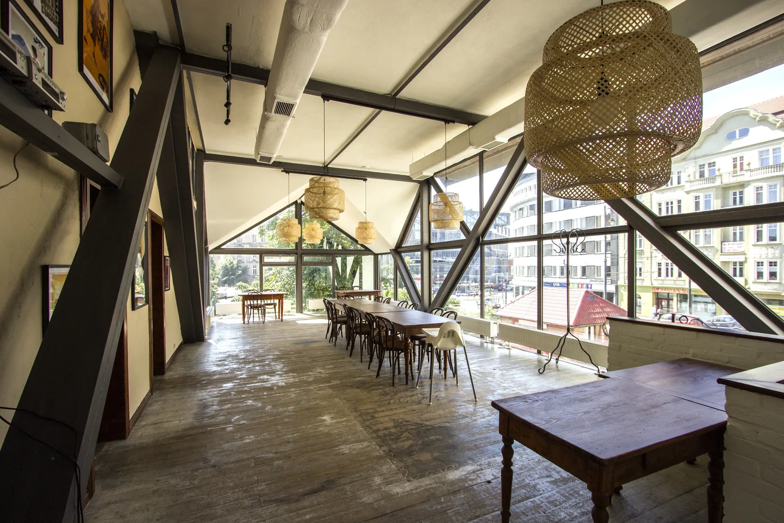
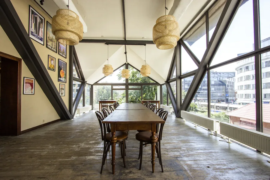
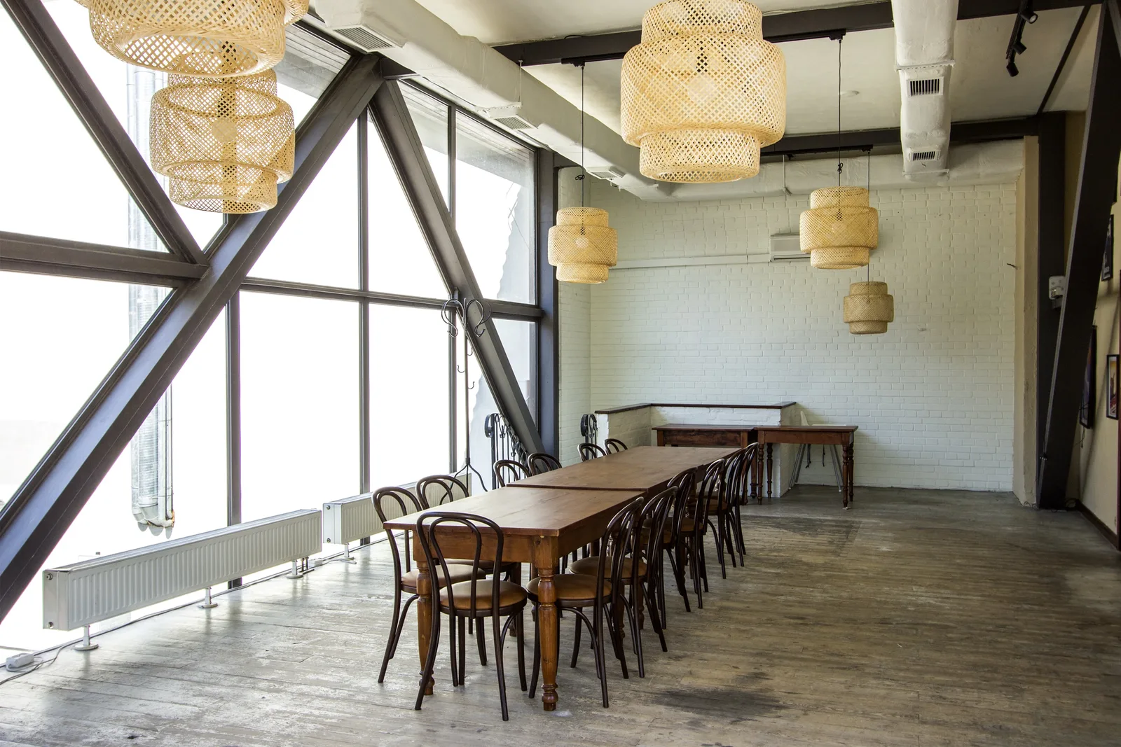
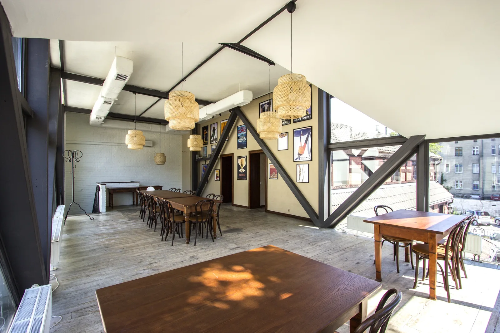
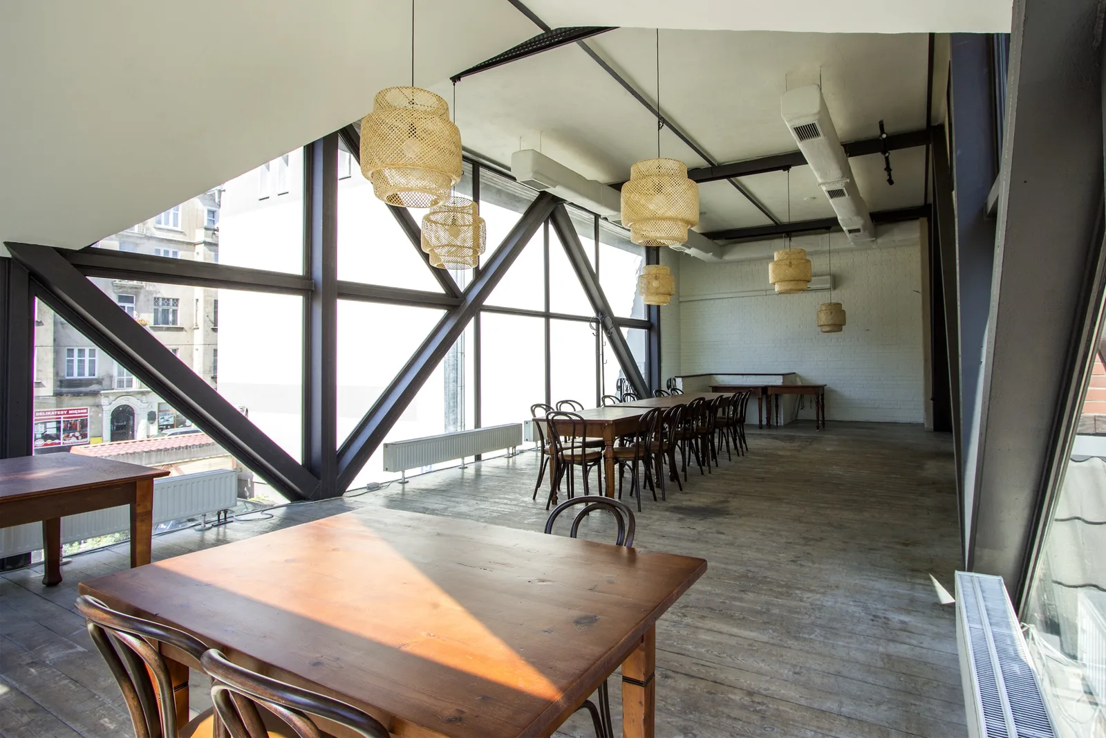
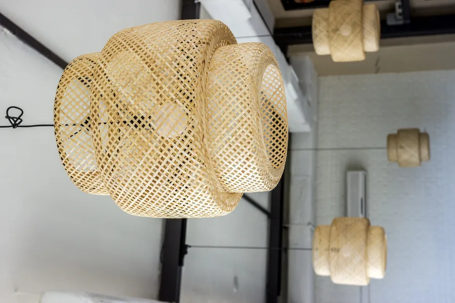
The 96-seat first floor is the spatial opposite of the ground floor: high and light, with the triangular steel-framed windows now fully unobstructed for the first time, flooding the space with natural light that the previous tenant had hidden behind curtains. Sinnerlig rattan pendants hang from the exposed timber roof structure above communal tables, whitewashed brick walls, and reclaimed timber floor. The ceiling height, over 270 centimetres, allows the angular steel window frames to become the dominant architectural feature. Total restaurant capacity across three rooms (seating 24, 30, and 40 guests respectively) reaches 145 persons. Lighting throughout was supplied by SevenPoints.
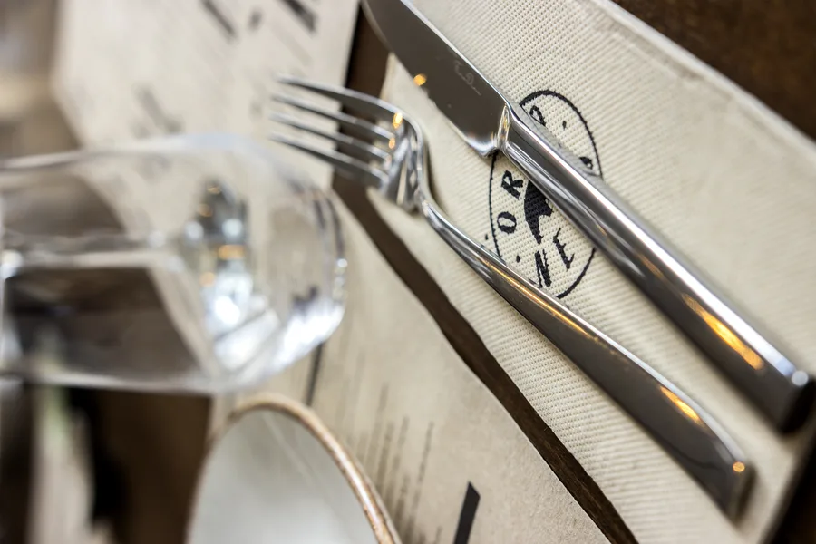
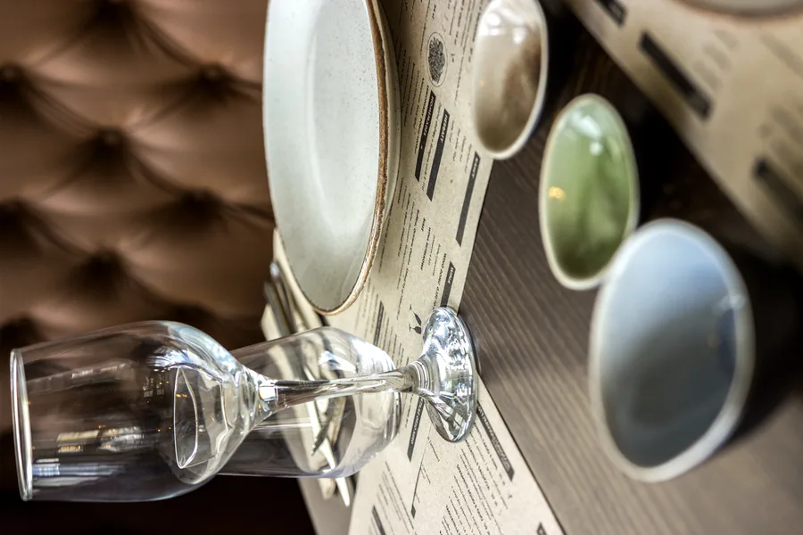
The identity carries on into everything a guest touches. Cloth napkins with the Orso Nero emblem embroidered on them. Artisan ceramic plates with terracotta rims and a speckled glaze, handmade dipping bowls in sage green, warm brown and powder blue. Kraft paper menus printed with the branding. No single object asks for attention, which is the point.
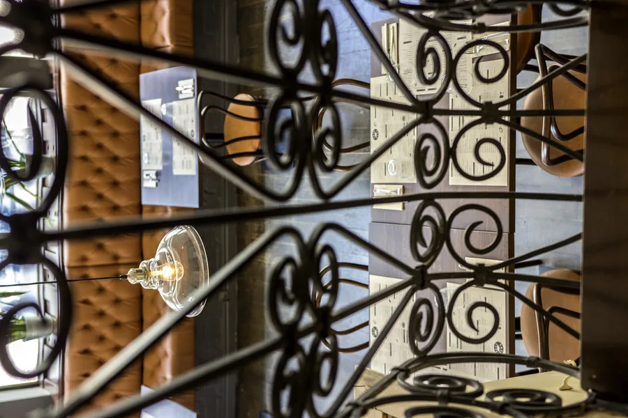
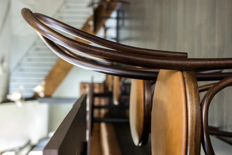
The Fameg A-18 bentwood chair, a Polish-made design in the Thonet lineage dating to 1876, was supplied by EUFORMA in dark walnut stain with golden-brown wood seats. Its selection was a strategic act of cultural curation: the bentwood silhouette is universally understood shorthand for the Viennese cafe, the Parisian bistro, the Italian trattoria. In Bydgoszcz, it anchors the entire interior in over a century of European hospitality tradition.
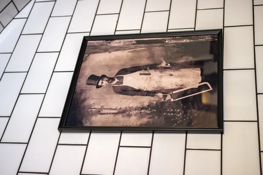
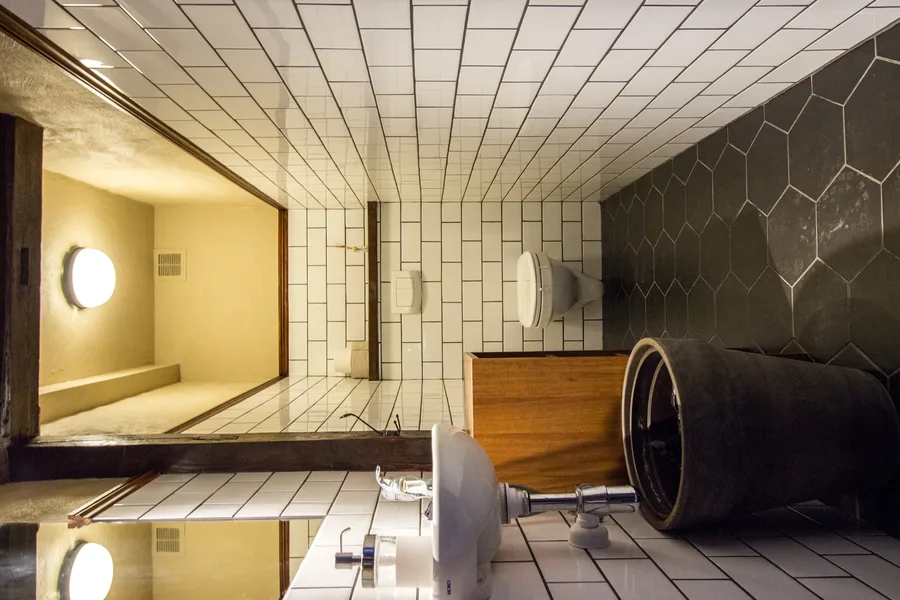
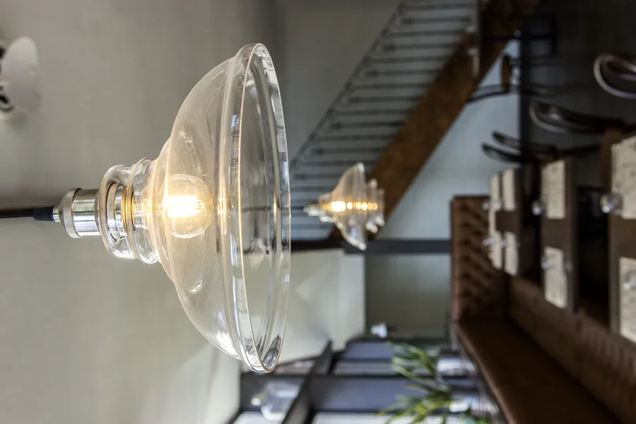

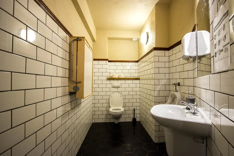
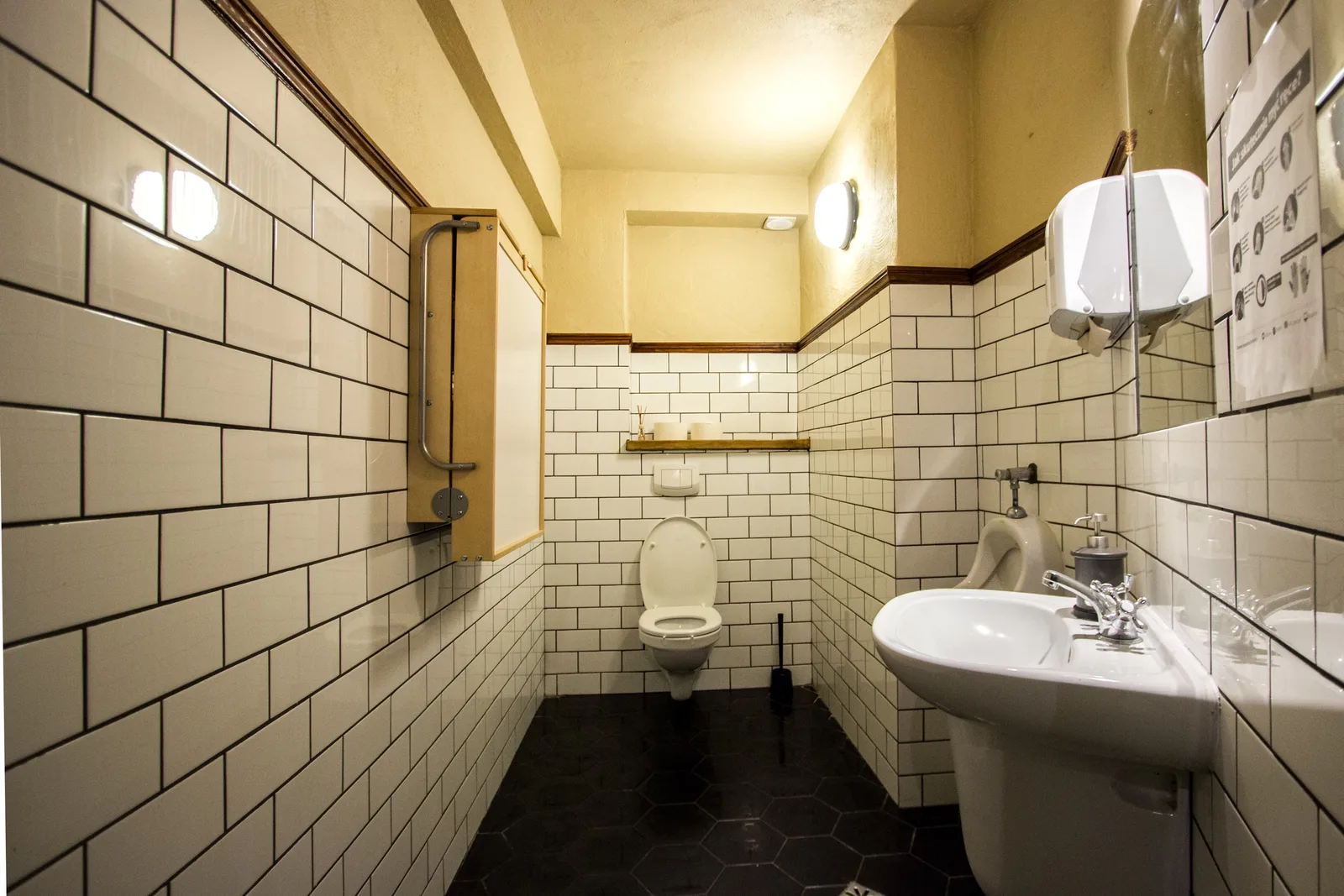
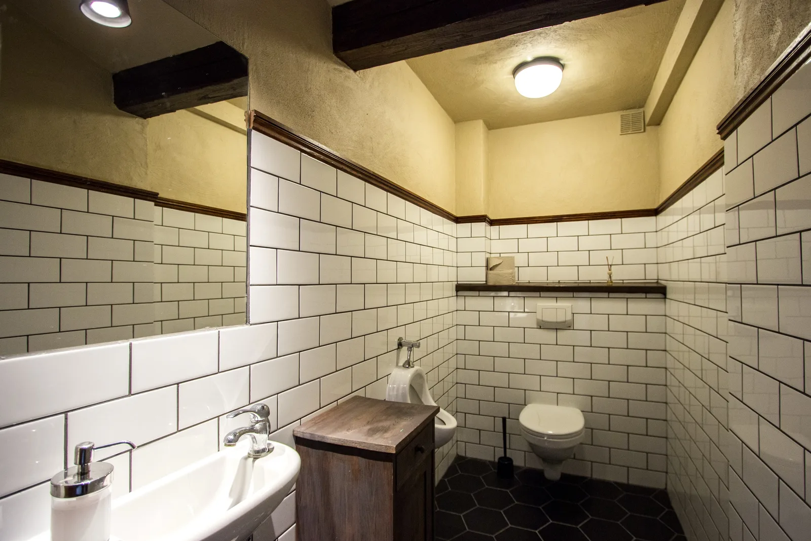
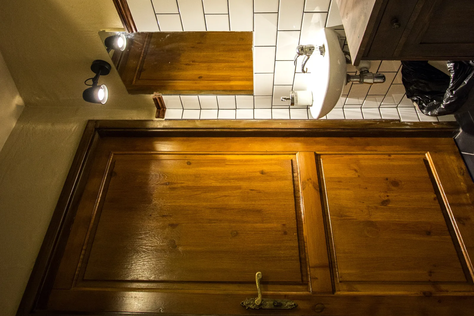
The bathrooms are a nod to old butchery backrooms. White-on-white subway tile with hexagonal floor tile, 6.6 square metres across the WC zones, dark varnished wood trim, industrial pendants. The vanity base is a repurposed wine barrel, which puts Italian winemaking into the one part of a restaurant nobody designs. VEO Lazienki did the fit-out.
Design development ran from late 2019 through the first half of 2020, beginning with a comprehensive site inventory survey on November 6, 2019 that documented the existing building across all three levels in 338 photographs. The complete drawing package of 20 pages, including floor plans, electrical layouts, furniture arrangements, bar detail drawings at 1:25 scale, and three terrace site plan variants (PZT1 to PZT3), was issued on May 5, 2020. Construction was executed through mid-2020 by general contractor Trzynastka, with specialist firms handling bathroom fit-out, lighting installation, and furniture supply. Professional photography was completed by Bartek M. (Kulpa) between July 31 and August 3, 2020, producing 54 images.
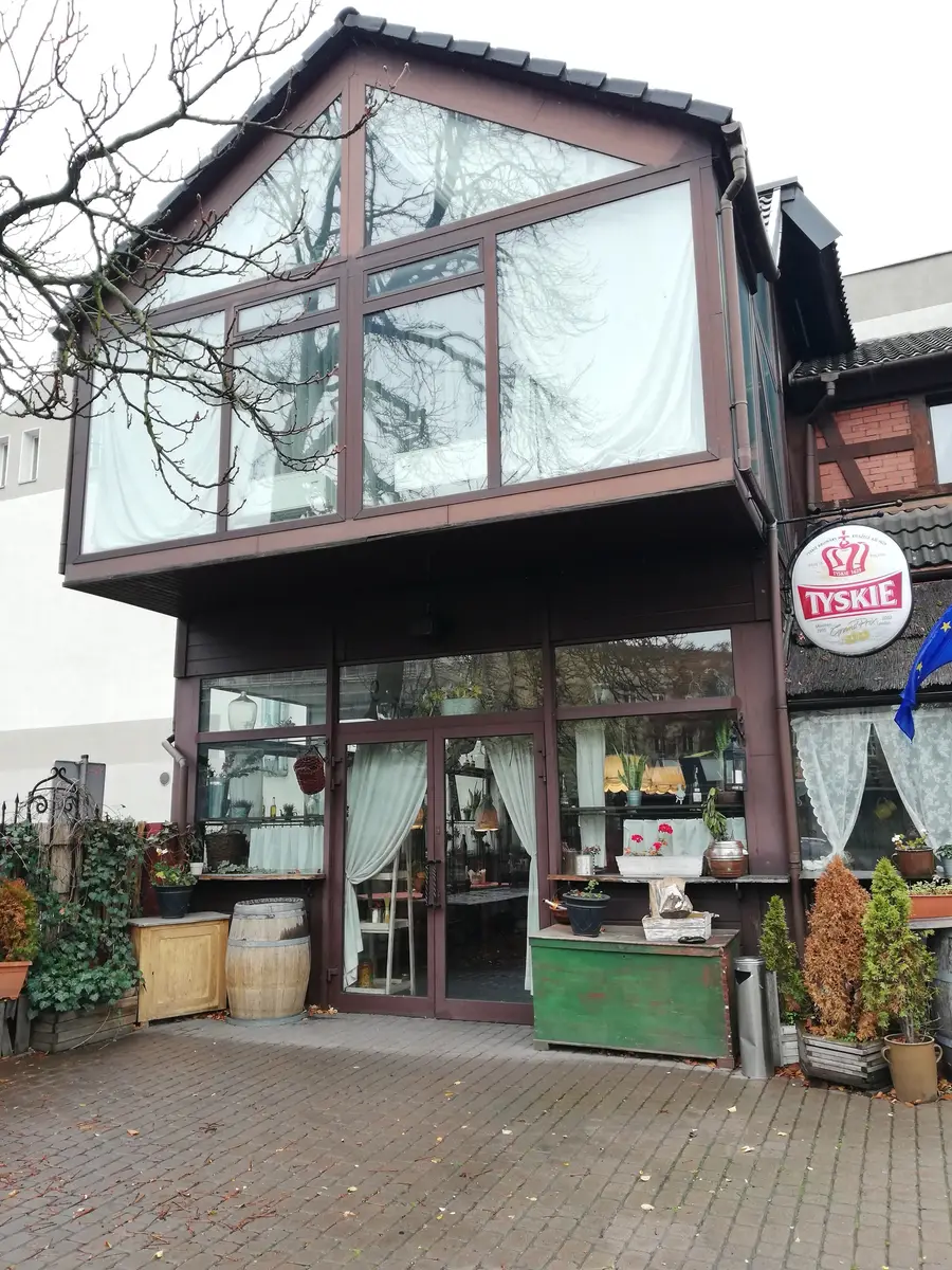
The Dolce Vita restaurant that previously occupied the forester's lodge represented the opposite approach: decoration applied over architecture, with curtains drawn across the first floor's triangular steel-framed windows to hide the building's most dramatic feature. The Orso Nero transformation inverted this entirely. Rather than adding spectacle, the design stripped away what concealed the building's own character. Every architectural decision, from exposing the timber roof structure to whitewashing the brick, followed this principle of revelation.
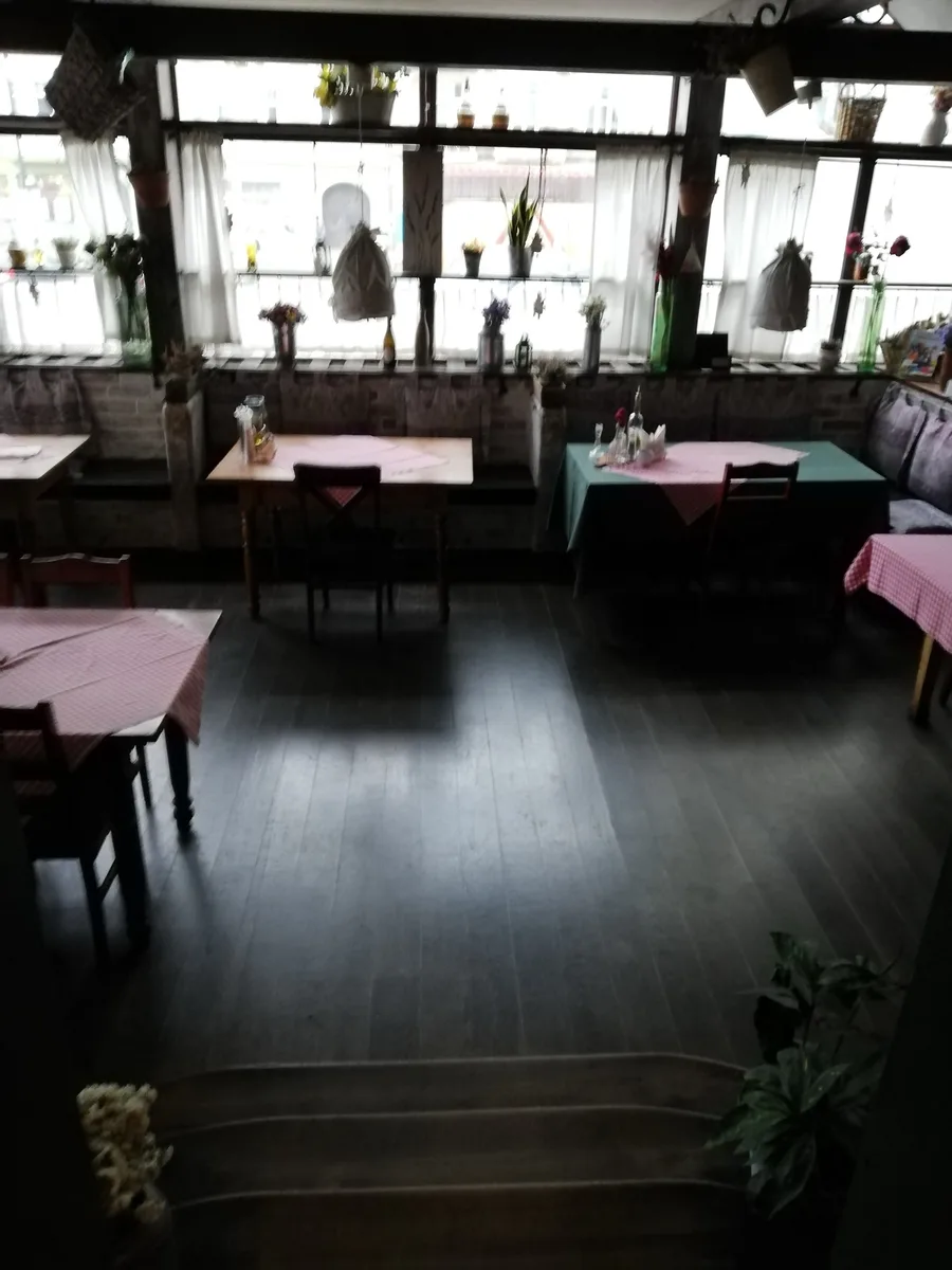
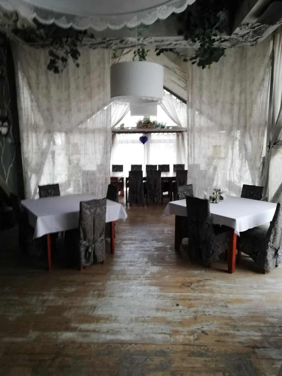
Orso Nero ran from mid-2020 to March 2023 and then sold. The building took Gusto Kuchnia & Wino from June to October 2023, and after that the celebrity restaurateur Magda Gessler turned it into Dzikowisko, a game-and-venison concept for the television programme Kuchenne Rewolucje. Dzikowisko is the opposite approach: theming applied on top of a building instead of drawn out of it. Nobody planned it, but that contrast says what Orso Nero was for better than any description of it could.