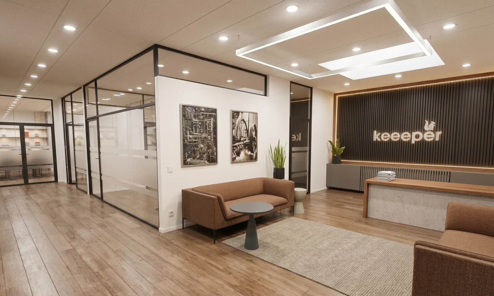
Keeeper Poland Corporate
Interiors
Keeeper Poland is two firsts for the studio. It is the first project where the whole concept was developed through AI image generation. Midjourney, DALL-E and Stable Diffusion did the work conventional 3D rendering would have done in the exploratory phase, producing four moodboard directions and three concept layouts before the design settled. It is also the first job run as a dual-entity delivery: the studio on interior architecture, a separate general contractor on construction. Both are now standard practice here.
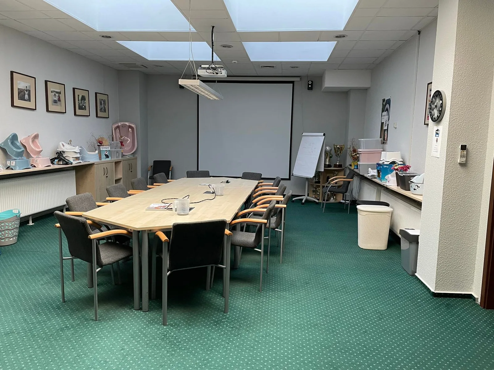
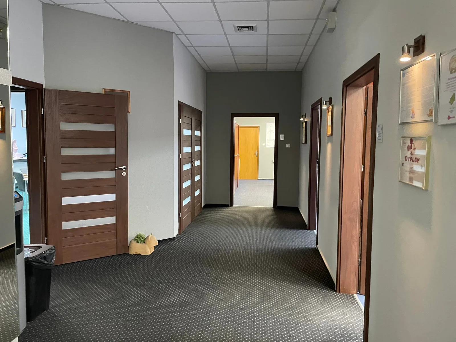
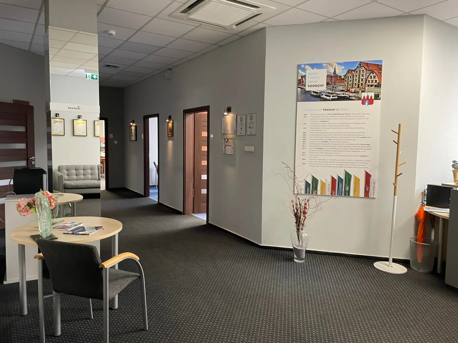
The client is the Polish subsidiary of a German household products manufacturer, and the job was a dated two-level office suite. The site survey in April 2023 found green carpet, tired suspended ceiling tiles and basic cabinetry. The place said nothing about the company inside it. Modernising was not enough. The office had to become an argument for the brand.
Four directions came out of the AI workflow: mint green, cool corporate blue, a loud industrial orange with exposed ceilings, and the warm neutral palette that won. What it became is wood-forward and restrained. The office carries weight without performing, and the product on the shelves is what you end up looking at.
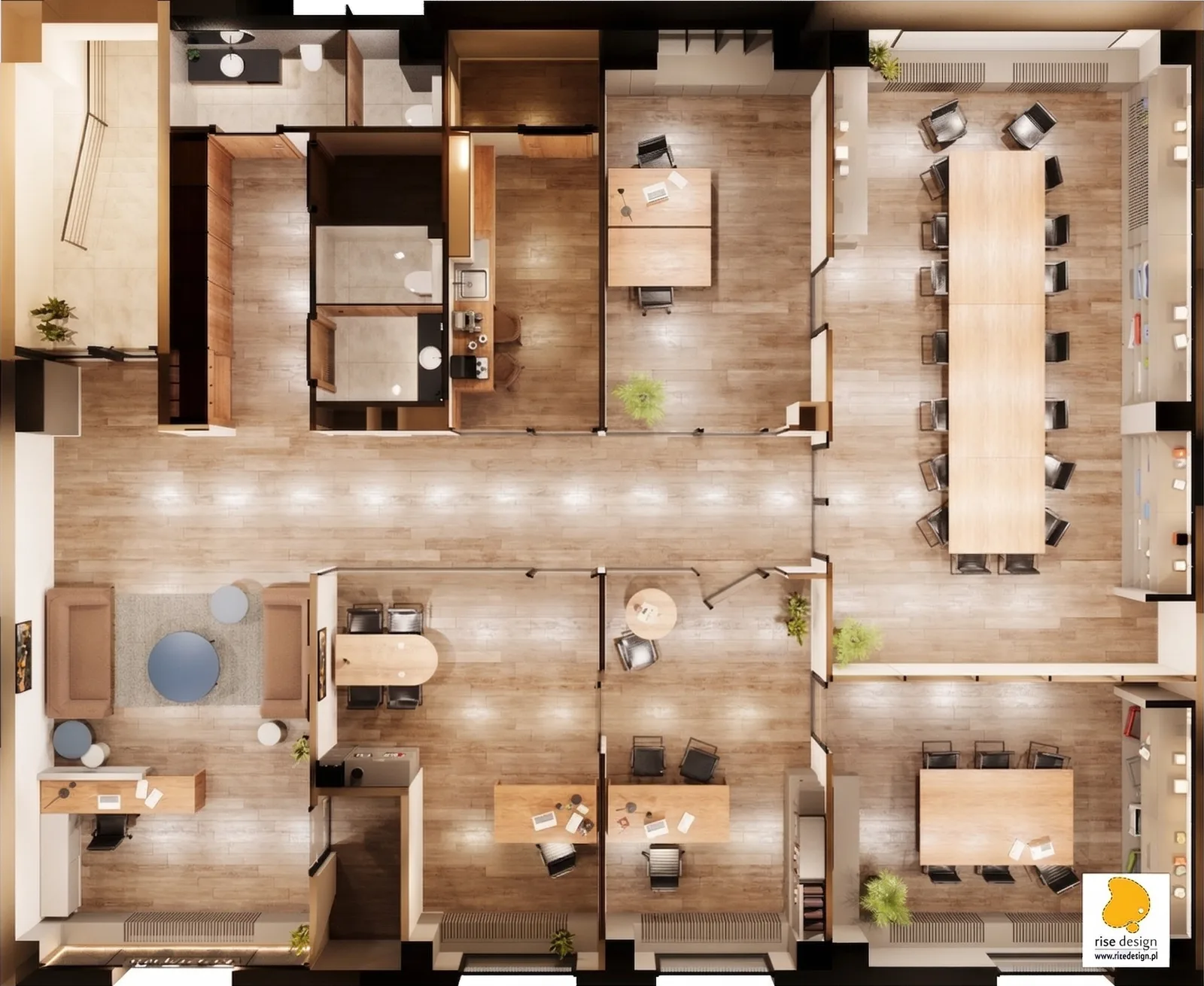
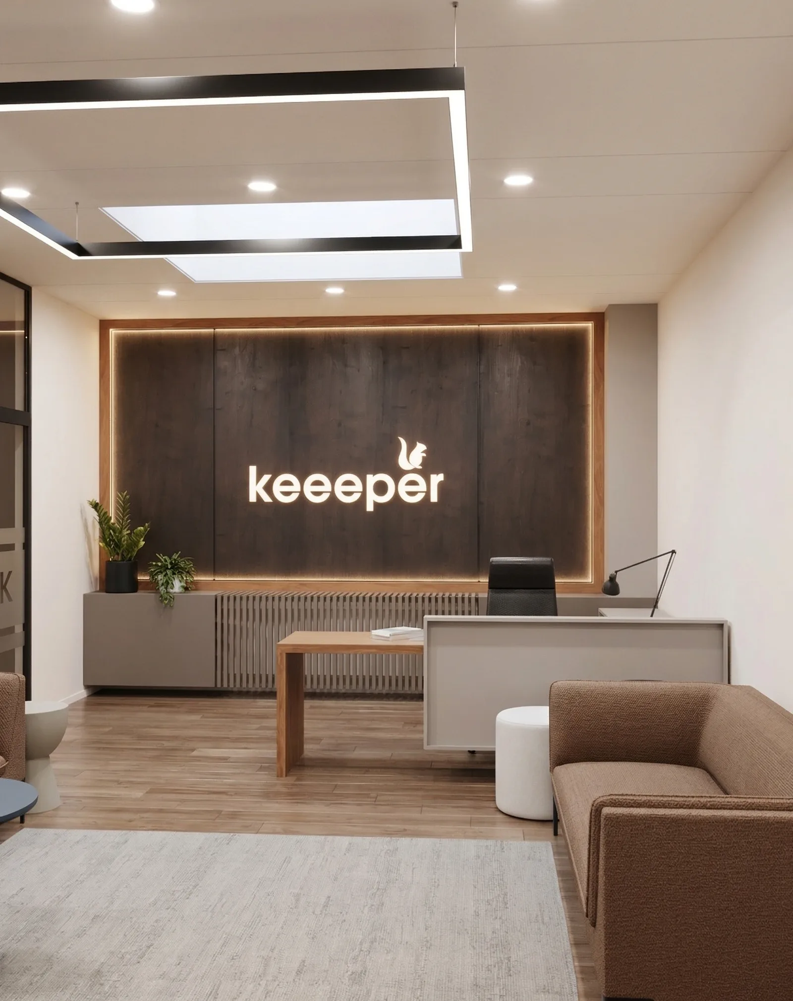
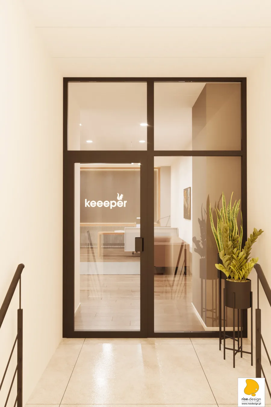
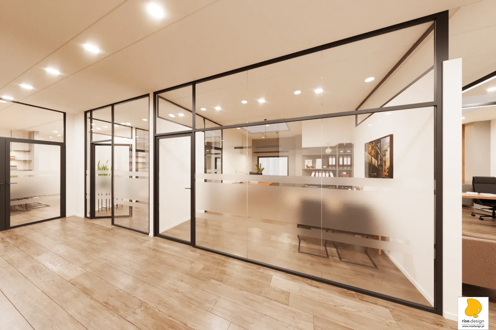
The Level 1 plan organises 385 square metres around a central corridor. Reception and lounge take the entry zone, held by a backlit keeeper logo on a dark walnut wall that tells you both whose building this is and where you are in it. The corridor is not just circulation. Jet-black aluminium-framed glass partitions with frosted privacy bands run its full length, so the floor stays readable end to end while each zone keeps its own edges.
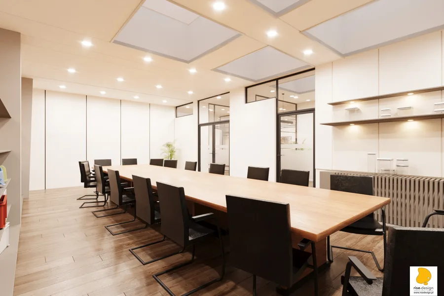
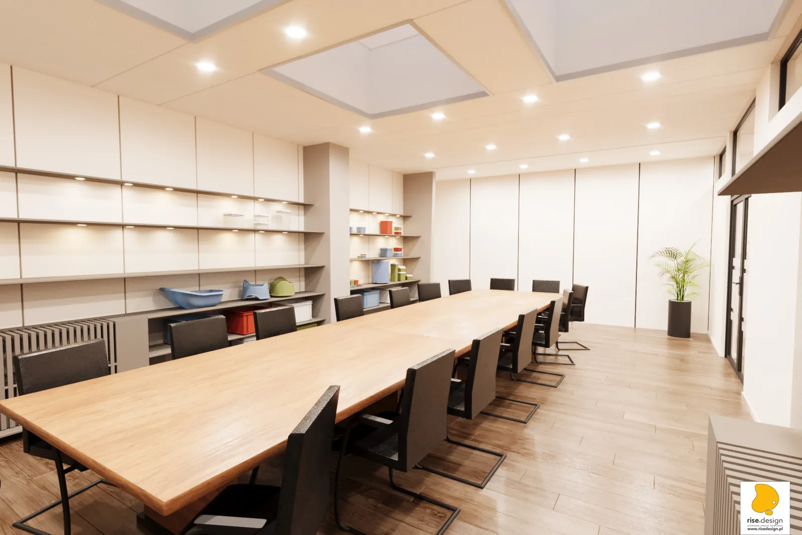
The conference room holds the interior zone with a long timber table and an AV wall. A high-performance acoustic mobile wall lets it open into the adjacent open plan or shut away from it. A manufacturing headquarters running board meetings one day and product presentations the next actually needs that. Ecophon panels run across the ceiling, because the same room has to work for six people talking quietly and forty people being talked at.
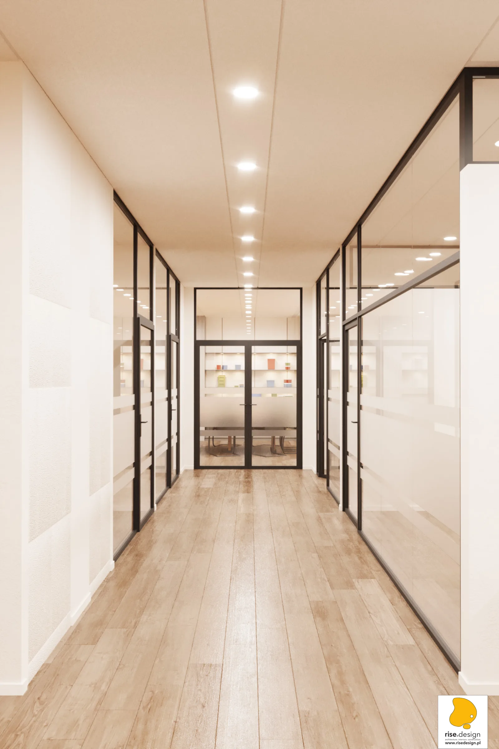
The open-plan secretariat keeps the same warm timber surfaces, with linear suspended LEDs running across the glass partition grid at right angles. The workstations still see the corridor. The Ecophon ceiling continues overhead, as it does across the whole floor, so the acoustics do not change when you walk from one zone to another.
The kitchenette and coffee point are where the office actually gathers. White cabinetry, wood backsplash, pendants, a bar-height counter with high stools. It is looser than the workspaces on purpose. The atmosphere changes without the materials changing, which is what makes people stop there.
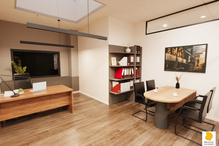
The executive office keeps its glass partition to the corridor, so it stays part of the floor visually while staying quiet. A walnut accent wall with framed artwork makes it more personal than anywhere else up here. It is the one room where the design lets an individual show through the corporate frame.
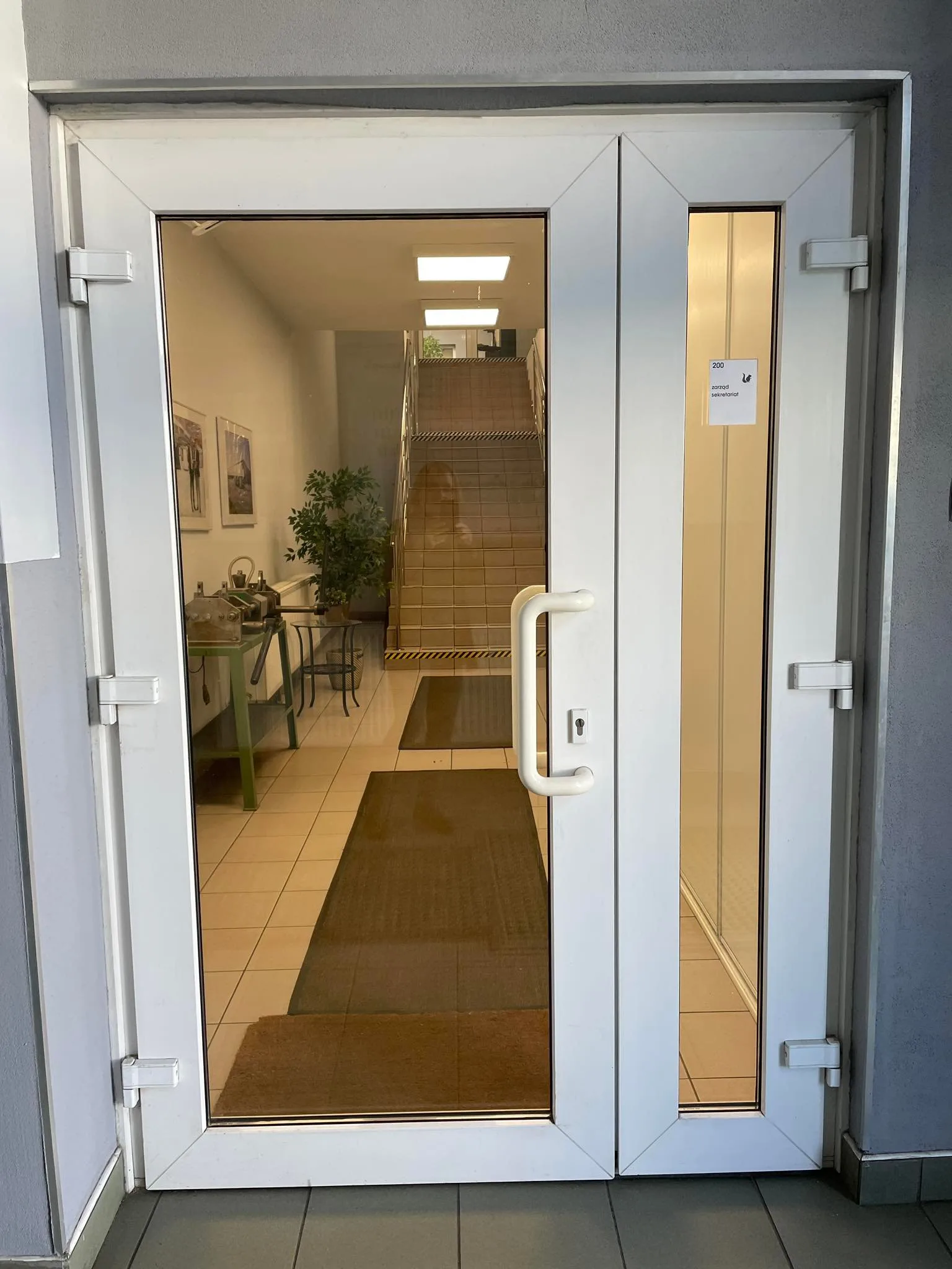
Arrival starts at ground level. A tiled staircase with a black metal railing and plants sets the materials before anyone reaches the office floor. Corporate signage and a wall sconce, understated and warm, say what is coming upstairs.
The product showroom puts the client's range into the reception zone itself. Walnut shelving with LED strips lit into it, so the keeeper products read as objects rather than stock. The brand stops being signage and becomes something built. This is the clearest version of the idea behind the whole project: an office should show what the company makes, not just house the people who make it.
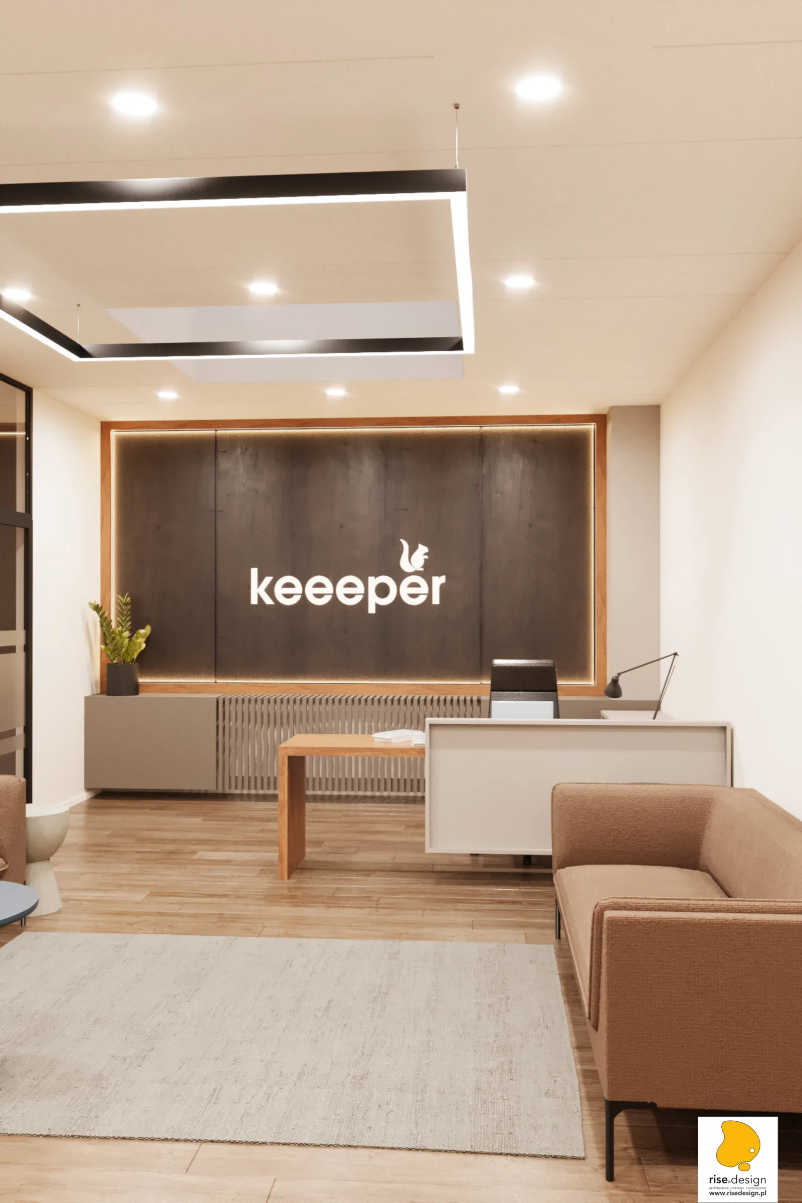
The reception desk is warm timber and carries the keeeper typography. It marks where the public arrival zone ends and the working interior starts. Warm downlighting does the rest, taking you out of the corridor's run of glass partitions into the softer lounge beyond.
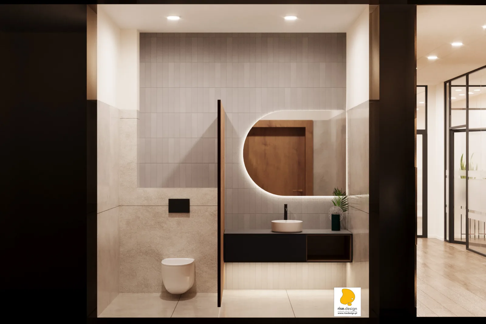
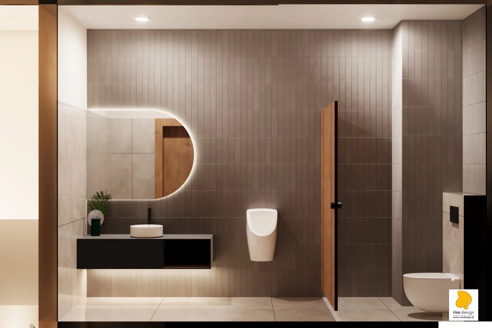
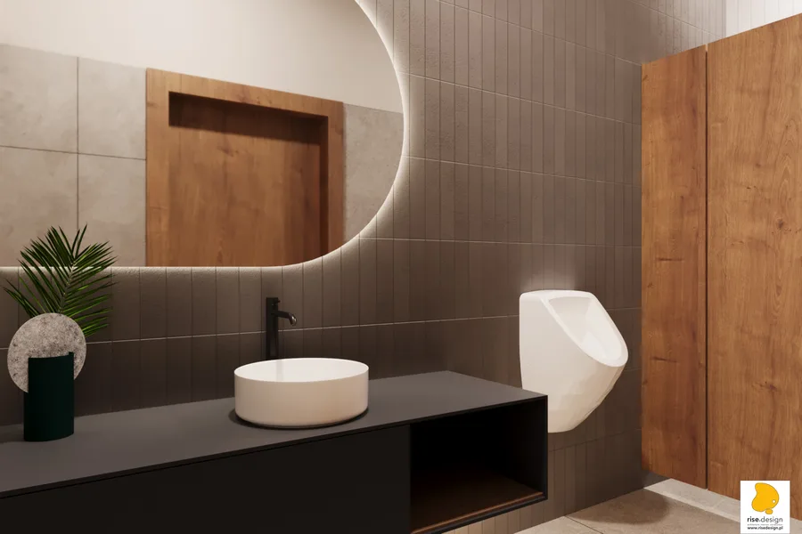
The bathrooms carry the dark accents from the office partitions through into the support spaces. Large-format grey tile, a backlit organic-shaped mirror, matte black fittings. These are the rooms a less committed project stops caring about, and they are finished to the same standard as everything else.
Textured dark wall tiles and concealed plumbing systems maintain the clean, minimal aesthetic. The matte black flush plate and wall-hung fixtures continue the hardware language established by the glass partition framing throughout the office.
The full technical package went out in September 2023: ten drawing sheets covering inventory, general layout, partitions, electrical, lighting, plumbing, flooring and ceilings. Five months from the site survey to the last sheet.
The pre-renovation photographs show what came out: green carpet, dated ceiling tiles, basic cabinetry, fluorescent light, a generic commercial interior with no relationship to the company inside it. Very little survived. Ceilings stripped and rebuilt across both levels, partitions demolished and rebuilt, and an acoustic ceiling system in place of the old tiles.